This is the fourth post I have written for my readers and I have decided to rename the blog 'Readerly Ramblings.' This is because the other regular blog I write for fellow writers is called 'Writerly Witterings.'
If you’re a reader that also has an interest in writing, do check it out, you might also want to join my writer’s keep in touch list, where you’ll receive a few writing related freebies, as well as access to the regular free online mini-courses I offer.
And if you haven’t already subscribed to my reader ‘keep in touch’ list, you can do so by following this link. I will then send you a free collection of short stories. (How to Get Away with Murder)

In this month’s blog post, I’m going to talk about judging a book by its cover. As readers, when we’re looking for a particular sort of book, we base your initial choice and level of interest on visual elements.
If looking for a childhood memoir, I would probably expect to find a white cover and an image associated with childhood. Fonts are a particular type and colour, for example, on a psychological thriller, usually red or another strong primary colour. Whilst we’re on the subject of colour, romance covers will be a pale colour, sometimes pink, with images of happiness and togetherness, whilst crime stories (like mine) will often have a blue/turquoise hue or a black surround.

The images are so important, they have to pique reader interest whilst offering a flavour of the story. And then there is the obvious choice of title that must convey exactly what a reader can expect.
In The Last Cuckoo, (Cover Credit: Darran Holmes Illustrator) which is pictured below, and now available for pre-order, you will see I have gone for the turquoise hue with dark red lettering.
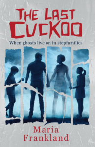
My cover designer used the image of a family and a torn effect to portray the divisions and the ‘faded’ mother to show her death. The story unfolds with tweets being received through her Twitter account, where the reader will be eventually led to the truth behind her death. The cuckoo depicts the self serving bird that lays its eggs in another bird's nest. So much thought goes into the cover design, and it is such an enjoyable part of the process.
I would like to thank my Advance Reader Team for being a vital part of the final production which has brought this novel towards its release on 4th March. If you would like to join this team, follow this link.
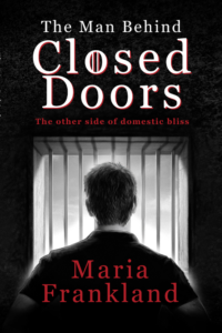
You will then have the chance to be involved in the final production of 'The Man Behind Closed Doors' (pictured below) ahead of its release in June. This book is also available to pre-order.
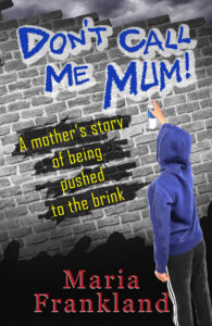
Here is the cover of 'Don’t Call Me Mum' (also designed by Darran Holmes.) Although the layout is similar to 'The Last Cuckoo,' and 'The Man Behind Closed Doors.' Hopefully it’s easy to see that it’s a different genre of book. However, reader feedback has told me that because of the strength of the story, it does actually read more as a novel than as a memoir! They have also told me that they couldn't put it down which is wonderful for any author to hear!
You can download this book for free between 20 and 22 February but if you don’t want to wait until then follow this link to grab your copy.
I would love to hear what attracts you, as a reader to the books you choose. What sort of books do you read and what do you base your decisions on? Post your responses into the comments section below.
This week (on Valentine’s Day!) I will officially become Mrs Maria Frankland so can stop confusing my reader and writer friends and followers who haven’t had a clue whether I’m Frankland or Stephenson! I’ll post a wedding picture in my next ‘Readerly Ramblings,' out on 21st February so do join my ‘keep in touch’ list if you’d like to see it!
Thanks for listening. Next month I’ll be talking about the unseen relationship that exists between a writer and a reader once the book has changed 'ownership.'
Bye for now!
Maria